Understanding the number of website visitors you get from each marketing channel is easy. You can install free analytics software like Google Analytics on your website, and it will give you that information out of the box.
But that doesn’t tell the whole story.
To understand what’s actually driving growth, you need to understand which of these marketing channels are bringing visitors that go on to sign up for a free trial or schedule a discovery call and eventually stick around and use your product or service for a long time.
Without understanding that, there’s a pretty good chance you are wasting time and money on marketing channels and campaigns that may be generating lots of website visitors, but very few paying, happy customers.
Fortunately, there is a solution.
In this article, we’ll show you why you must send proper marketing attribution data to your product analytics tool and how to do it. We’ll also explore some example reports you can run, which will help you understand what marketing channels and campaigns are driving growth.
Why Having Marketing Attribution Data Is Critical
The channel a user comes from (e.g., organic search, paid search, paid social, or others) is one of the biggest factors determining how well they progress through your onboarding process and ultimately convert into a paying customer.
This is because the channel they came from is a proxy for intent. Website visitors who come from an organic search have likely searched for your product or a product like yours, and are likely to be experiencing the problem your product solves and are actively looking for a solution.
On the contrary, people who have come from your Instagram ad have likely been browsing photos from family and friends, seen an ad that half-interested them, and tapped on it to check out your product. They’re probably not experiencing the problem your product solves and likely don’t have an immediate need for it. As a result, they’re much less likely to invest the time to go through your onboarding process and start actively using your product.
A good example of this comes from the marketing attribution tool Attributer.io. The below graph shows the number of people who complete the onboarding process:
As you can see, people who come from organic search complete the onboarding process and reach the activation point nearly twice as much as people from paid social sources. This is even though all these people have the same in-app experience, get the same onboarding emails, and more.
This shows why you need proper attribution data in your product analytics tool. If you’re getting a lot of low-intent signups (like from Facebook Ads) it’s going to look like your activation rate is low, and you could spend a lot of time and development resources trying to improve it when in reality, the problem is signup quality.
How to Get Proper Attribution Data in Your Product Analytics Tools
Tools like Amplitude and Mixpanel (as well as Segment if you’re using it to send data in) will capture UTM parameters and the referring domain out of the box when you use their client-side SDKs.
While this is a good start, using this data in reports is messy.
An excellent example of this is organic search. Google alone has 37 different domains it uses, so if you wanted to run a report that shows you the activation rate of people from organic search compared to those from your paid ads, it would be almost impossible.
Instead of having one line on your graph for organic search, you would have 37 different lines for each of the different domains Google sends traffic from.
Fortunately, Amplitude has a solution to this. Their new Channel Classifiers feature allows you to create custom channel groupings (similar to the channels you see in Google Analytics) and then use those to segment your reports.
To make it easy, Amplitude have set up a series of default channels, but you can modify them or create new channels.
A typical example might be if you drive new user acquisition through some sort of product virality. For example, a website chat product that places its logo or a different brand element on the chat widget.
You could set up UTM parameters on the link to your website and then create a custom channel called “Virality.” You could then use this to see how many signups you get from virality, what the activation rate is compared to other channels, and more.
Once you have these Channel Classifiers set up in Amplitude’s data section, you can use them in your reports just like any other User Property.
Example Reports You Can Run with Proper Attribution Information
Now that you know how to get proper marketing attribution data in your product analytics tool and how to use it in reports, the next step is figuring out what to look at to get valuable insights.
While you can use the attribution data to segment almost anything, the following reports are an excellent place to start.
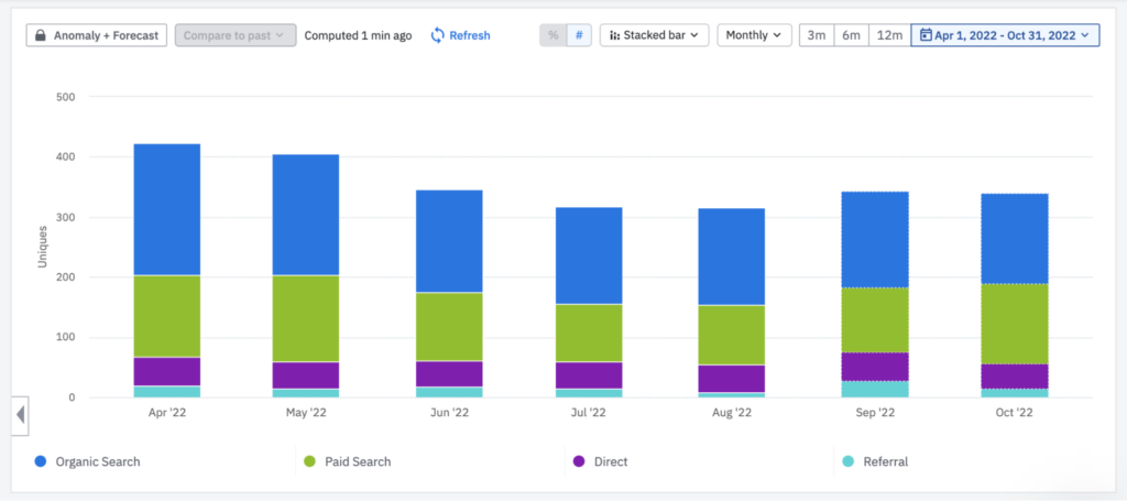
Signups by Channel
The above chart shows how many signups are generated each month, broken down by channel. This is an excellent first step to understanding how your marketing mix impacts your product metrics.
You can see which channels are driving your signups and get an understanding of which one’s might be impacting your product metrics — channels with a low volume of signups are unlikely to impact metrics like activation rate, conversion rate to a customer, and more.
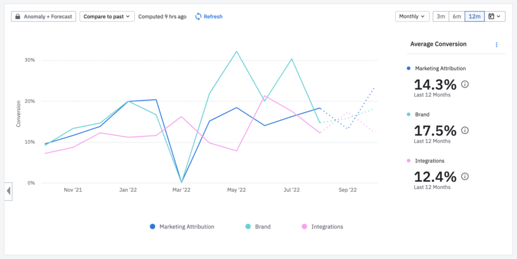
Activations by Campaign
This report shows the activation rate of users who have come from Google Ads, broken down by the campaign they came from.
This is important because, like most companies, you are probably bidding on groups of keywords with different levels of intent. For instance, you might be bidding on brand terms (e.g., Attributer), category terms (e.g., marketing attribution tool) as well as problem terms (e.g., UTM parameters in Salesforce).
This report will help you assess how each of those campaigns is performing when it comes to generating active users of your product (as opposed to just website visitors or signups) and gives you a better idea of where to invest your advertising budget.
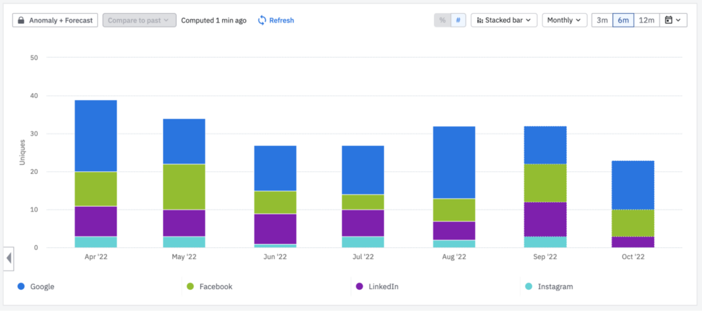
Customers By Source
The above chart shows how many customers came from each of the leveraged paid advertising sources.
This is beneficial information for your marketing team, who, without it, would probably only measure the number of visitors and signups they get from each of these networks.
But by seeing the performance of their paid sources all the way through the funnel to paying customers, they can make much better decisions about which sources are generating customers at a positive ROI, and, subsequently, where they need to invest their time and resources.
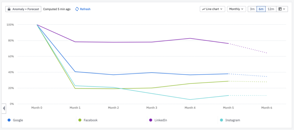
Retention Rate by Source
The above report shows the monthly retention rate of customers, broken down by the various paid sources the customer initially came from.
If you’re like most SaaS companies, you likely charge a smaller monthly fee and rely on the customer sticking around for many months to make back the customer of acquiring that customer (which is known as the payback period).
In B2B SaaS, it’s common to need a customer to stick around for over a year just to pay back the money you spent acquiring them.
This is why looking at retention by the source is so important. If you are paying to acquire customers, but they are churning before they actually pay back the cost of acquiring them, you are essentially burning money in paid advertising.
But by empowering your marketing team to see the retention rate by source in your product analytics tool, they can understand which sources are actually profitable and adjust their budgets accordingly.
Over to You
By getting accurate marketing attribution data in your product analytics tool, you can run various reports that help you understand which of your marketing channels and campaigns are generating paying, happy customers.
And by understanding that, you have a better idea of what you need to do to grow your business.


Leave a Reply