Last Updated on: January 23, 2023
When you use a tool for years, you tend to get comfortable with it. You’ve been there, done that. So when a feature surprises you, a feature that has been there for a long time, you make sure others know about it. No matter how small it is.
I work in Mixpanel for 1-2 hours a day. If I am deep into a project, I may be in there for 8 hours a day. On top of that, I spend most of the rest of my day in Kissmetrics, Google Analytics, Amplitude or Mixpanel, and Segment.
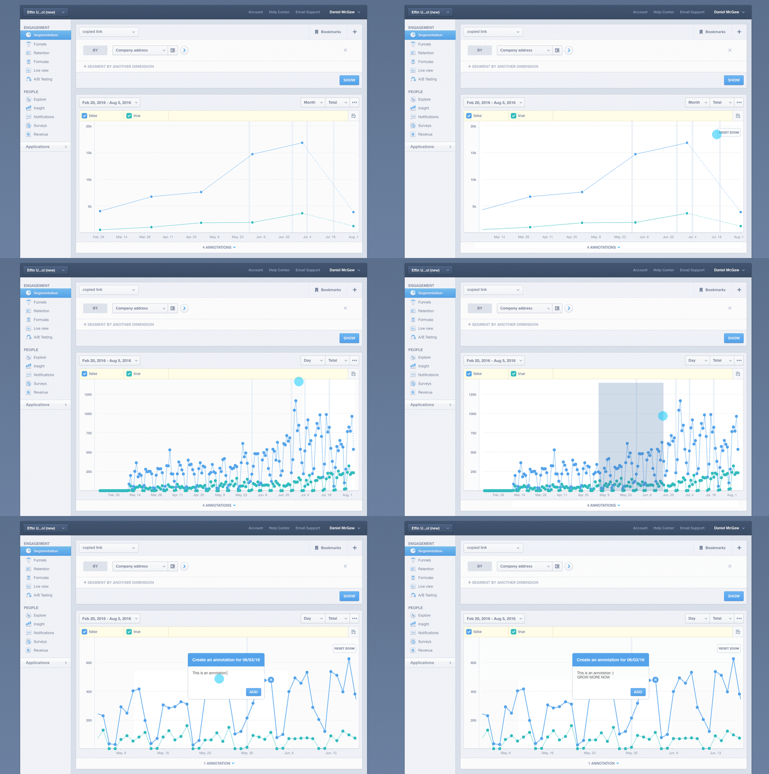
When reviewing a report recently, I accidentally clicked on the white space of the segment report and dragged. It showed this crazy blue color. When I released the mouse click, it zoomed into that period of time. This simple feature which does something |____| this big made my entire day.
Just make sure you are trying to look at a time span that you can zoom in on. As you can see in the GIF below, you cannot zoom into a month and expect it to convert to days; you need to select a measure of time which can be zoomed into. :)

When reviewing the Segmentation Report in Mixpanel, I used to use date picker for this kind of analysis. I would see a trend and then use the date picker to zoom into that period to do more analysis. This took longer, did not give me ease of use, and was not the right UX.
Luckily enough, Mixpanel had this tiny feature that made my day. Hopefully, it will make your day too. :)
Leave a Reply